Best Fonts for a Resume in 2025: Resume Font Tips
Create Your Resume NowWhat is the best font for a resume? Any fonts to avoid? Serif or sans serif? What’s the right resume font size? So many questions...
Luckily, I've got all the answers you need to help you choose the best font for your resume.
This resume font guide will show you:
- The best resume fonts to choose and fonts to avoid.
- The right resume font size that also works for cover letters.
- Pros and cons for each recommended professional resume font to make your decision easier.
Want to save time and have your resume ready in 5 minutes? Try our resume builder. It’s fast and easy to use. Plus, you’ll get ready-made content to add with one click. See 20+ resume templates and create your resume here.
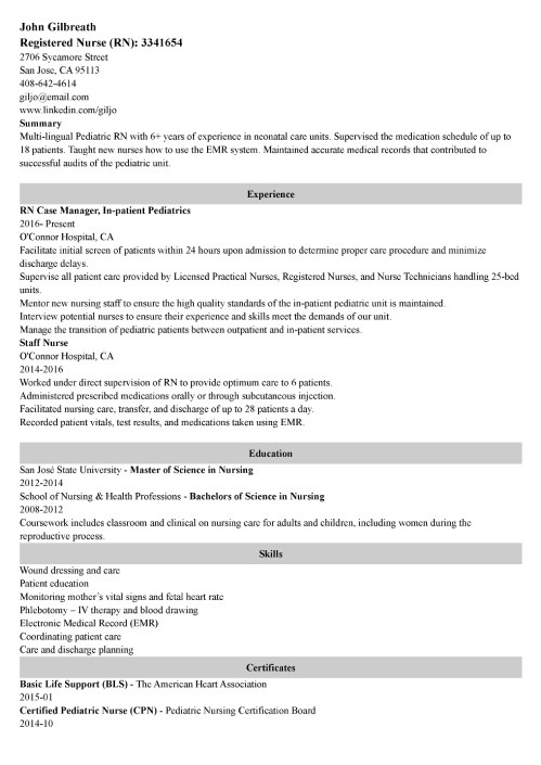
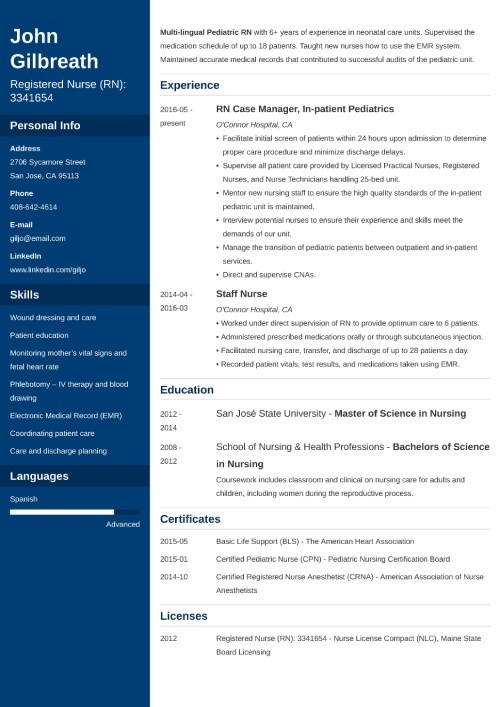
Sample resume made with our builder—See more resume examples here.
What Font Is Best for a Resume in 2025?
Recruiters and hiring managers take 7 seconds to initially scan your resume, according to our HR statistics report. That’s just about how long it takes the average person to read these two sentences. The font you pick has to be legible and perfectly suited for your job application. It has to boost the readability of your document, not lower it.
Classic resume fonts include Arial, Times New Roman, Cambria, and Garamond. They’re highly popular because they’re easy to read and widely available, which makes them perfect fonts for a resume. Using them will help you present your background information neatly.
However, your choice isn’t limited to these typefaces. If you feel like trying out something different, read on to find tips on making your selection.
Having a great font is good—but creating an ATS-friendly resume is even better. Learn how to do it right: ATS Resume Format
How to Choose the Best Font for a Resume?
Here are some tips to follow when choosing the best font for your resume:
1. Set a Correct Resume Font Size
Font size impacts not only text legibility but also the emotional response that written words induce. That’s why the font size on a resume matters. Opt for the standard 12 points: this classic and easily readable font size works both for a PDF version of your resume and a printed one.
Larger fonts are good for emphasizing your name and section headings. If you can't fit your content on one page, try using a sans-serif font at 10 points, but that's the minimum font size you should use.
2. Use Bold and Italics Wisely
Formatting your text can also boost or lower the readability of your resume. There are three simple rules to follow:
- Bold text is great for drawing particular attention to a few words. It can help subtitles stand out without enlarging them.
- Italic text is great for supporting text, just like the smaller font size we mentioned before. Use it in places like the city and state related to a university or degree listing, for example.
- Avoid underlining words or phrases in a resume or cover letter, as it just adds too much formatting and makes the document feel cluttered.
3. Choose Between a Serif or Sans-Serif Resume Font

Choosing between serif and sans-serif fonts for your resume can influence its readability and overall impression. Serif fonts give a more traditional feel, while sans-serif fonts offer a more modern, sleek look.
Some indicate that serif fonts are said to be slightly easier to read, as those little brushstrokes on each letter help your hiring manager’s brain to compute what they’re reading just a little bit faster. However, the science is not conclusive in this regard and sans-serif fonts are prized on modern resumes for their contemporary look and seamless integration with today’s resume designs.
4. Try Pairing Resume Fonts

One common trick that many visually-inclined resume makers use is to pair two fonts on a resume. The best font pairs agree with each other, work together in harmony, and don’t fight the reader for attention.
Many job seekers who pair fonts choose two contrasting typefaces, perhaps a standard script with a cursive script or sans-serif with serif. Then, they would use one for the main content and the other for larger elements, such as their name and section titles.
Creating a resume with our builder is incredibly simple. Follow our step-by-step guide and use content from Certified Professional Resume Writers to have a resume ready in minutes.
When you’re done, Zety’s resume builder will score your resume and our resume checker will tell you exactly how to make it better.
15 Best Fonts for Your Resume
Now, let’s see a detailed overview of my top 15 picks for the best resume fonts that can work for various professions.
1. Calibri

Calibri was created to replace Times New Roman as the default font for Microsoft Office. It’s a contemporary font that simply tries to maximize relatability, skipping dated serifs but without the intense flourish of other modern fonts—perfect for today’s professional resume.
Calibri as a resume font—pros and cons:
- Pros: As a default font, Calibri will usually render correctly when a hiring manager opens your resume. It’s a professional and easy-to-read font, and it won the TDC2 2005 Type System award from the Type Directors Club.
- Cons: As a default font, it also means other job seekers may use Calibri, which means your resume might not stand out from others.
Calibri is a great resume font for:
2. Cambria

Like Calibri, Cambria was also commissioned by Microsoft and created in 2004. With its serifs (those little lines at the end of each stroke in a letter; we’ll get to them soon), Microsoft states that it was “designed for on-screen reading and to look good when printed at small sizes.” That makes it a great font for the contents of your resume. I personally consider it one of the best cover letter fonts.
Cambria resume font—pros and cons:
- Pros: Cambria makes it easy for readers to decipher smaller text sizes quickly.
- Cons: It is often described as “traditional,” which may make it less suitable for more modern jobs.
Cambria is a great resume font for:
3. Helvetica

Helvetica is a gorgeous, easy-to-read sans-serif font that remains popular in the advertising industry. Both the New York City subway system and major corporations like BMW use Helvetica for their signs.
Helvetica resume font—pros and cons:
- Pros: Many professionals rank Helvetica as one of the more beautiful sans-serif fonts. A perfect font to use on a CV!
- Cons: Helvetica comes preloaded on Macs, but it isn’t listed under fonts in Microsoft Word. You’ll have to buy it if you want to use it and don’t have a Mac.
Helvetica is a great resume font for:
4. Georgia

Designed for Microsoft in the early 90s, Georgia is still one of the most popular fonts used today. It’s used by the New York Times online and by many big corporations, such as Yahoo and Amazon. Georgia is easy to read online, making it ideal if you plan to send your resume as a PDF.
Georgia resume—font pros and cons:
- Pros: Georgia is available across writing platforms. It’s accessible and a fine replacement font for other serif typefaces, like Times New Roman. It was recently re-released and updated (2013).
- Cons: Georgia’s popularity may make it hard for you to stand out. Also, it was inspired by Scotch Roman designs of the 19th century, so if you want to stand out, you might want to go with something else.
Georgia is a great resume font for:
5. Verdana

Matthew Carter created Verdana for Microsoft as the sans-serif sister to Georgia. He designed the font so that it is easy to read in small print on computer screens. Verdana remains one of the best professional fonts for resumes, CVs, and cover letters alike.
Verdana resume font—pros and cons:
- Pros: Great for job seekers who need to squeeze more onto their resumes, as it was optimized for small-print legibility.
- Cons: If you’re seeking a “wow” CV font, keep on looking. Verdana doesn’t look all that different from Arial, and Arial looks like Helvetica.
Verdana is a great resume font for:
6. Garamond

Garamond is a family of fonts with a long history, dating back to 15th- and 16th-century designs. Many describe Garamond as timeless. Its elegant, classic appearance makes it a favorite for printed resumes, conveying professionalism and readability without appearing too modern or flashy. The font's sharp serifs and moderate stroke contrast help enhance legibility, even at smaller sizes, which is ideal for fitting more text on a page.
Garamond resume font—pros and cons:
- Pros: Among designers and ad managers, Garamond is a favorite. It meets all the requirements of a good resume font: easy to read, attractive, classy, and not something everyone and their mother uses.
- Cons: Some might say that Garamond’s timelessness is just a more optimistic way of saying that it’s old; it is from the 1400s, remember?
Garamond is a great resume font for:
7. Trebuchet MS

Trebuchet MS’s rounded forms and slight irregularity give it a friendly and approachable appearance, while not impacting its legibility. With its wide, open letters and clean lines, this resume font offers excellent readability, which is ideal for modern resumes that need to be both eye-catching and easy to scan.
Trebuchet MS resume font—pros and cons:
- Pros: Microsoft released Trebuchet as one of its core web fonts. It is easily found on competitors such as Google Docs.
- Cons: If you want to utilize some additional features for the Trebuchet MS font, such as small caps or text figures, you’ll have to pay for the commercial version, Trebuchet Pro.
Trebuchet MS is a great resume font for:
8. Lato

Łukasz Dziedzic, a Polish typeface designer, designed the Lato font for a large corporate client, which is why he wanted this typeface to have both serious and friendly qualities. That dual nature gave it the “feeling of the summer,” so he named the font after the Polish word for summer.
Lato resume font—pros and cons:
- Pros: As an open-source font (SIL Open Font License), you can download and use it for free. Lato is also a corporate font, so you can rest assured that it’ll work well on your resume. It can be found in the Google Font library openly.
- Cons: Lato is not a standard Microsoft Word font. That might mean that it will not load when some hiring managers open your resume.
Lato is a great resume font for:
9. Book Antiqua

Book Antiqua is a serif typeface that radiates classic, refined elegance, making it an excellent choice for candidates who want to highlight their professionalism. This font is highly readable due to its clear, distinct letterforms and well-spaced characters, which allow for a smooth reading experience even in dense blocks of text.
Book Antiqua resume font—pros and cons:
- Pros: As a Microsoft version of Palatino, it is readily available on most operating systems and office programs.
- Cons: Palatino is based on humanist styles of the Italian Renaissance, so it may make your resume feel, well, antique.
Book Antiqua is a great resume font for:
10. Didot

Didot is an elegant font designed just before the French Revolution. While not as old and classic as Garamond, it was born during the Enlightenment and the reign of Marie Antoinette, so it’s a good font for dressing up your resume.
Didot resume font—pros and cons:
- Pros: Many professionals associate the font with fashion; Ralph Lauren and Marks & Spencer use Didot on their websites. Its elegance qualifies as a safe choice if you must go with something fancy.
- Cons: You must purchase Didot if you want to use it on your resume. Too much Didot on a page takes it from tastefully elegant to endangering your resume from suffering the same fate as Madame Déficit.
Didot is a great resume font for:
11. Roboto
 Roboto, released by Google in 2011, is a modern, clean, and geometric sans-serif font. Its balanced letterforms and legibility at various sizes make it ideal for digital-first resumes and portfolios.
Roboto resume font—pros and cons:
- Pros: Versatile and sleek, Roboto works across all digital formats, ensuring compatibility on Android and other platforms.
- Cons: Its popularity in tech may prevent it from standing out on your resume if you’re looking for a job in that sector.
Roboto is a great resume font for:
12. Tahoma

Tahoma, released by Microsoft in 1994, is a humanist sans-serif font valued for its clarity and compact design. Its open letterforms and tight spacing make it ideal for fitting more content on a resume while maintaining readability, especially in smaller sizes or dense layouts. Perfect for modern, professional documents, Tahoma balances efficiency with legibility.
Tahoma resume font—pros and cons:
- Pros: Tahoma offers clarity at smaller sizes, allowing for dense yet readable resumes.
- Cons: Its tight spacing may feel crowded in longer blocks of text.
Tahoma is a great resume font for:
- Customer Service Representative Resume
- Sales Manager Resume
- IT Project Manager Resume
- Event Manager Resume
13. Palatino

Palatino, designed in the 1940s, is a serif font inspired by Renaissance calligraphy. It’s known for its elegance and high legibility even in smaller sizes. Palatino’s balanced proportions and open letterforms make it highly readable, making it an ideal choice for professional resumes.
Palatino resume font—pros and cons:
- Pros: Palatino’s refined look makes it ideal for resumes requiring a touch of sophistication and professionalism.
- Cons: Its historical roots can make it feel overly formal for some modern industries.
Palatino is especially suitable for:
14. Times New Roman

A classic: Times New Roman, designed for The Times in 1931, is a serif font known for its formal, academic style. Its timeless design makes it a reliable choice for traditional industries and formal documents where professionalism and readability are key. Despite its wide use, it remains a safe choice for all resumes.
Times New Roman resume font—pros and cons:
- Pros: Universally recognized, Times New Roman is a safe choice for conservative industries.
- Cons: While authoritative, it is often seen as outdated for modern resumes and overused.
Times New Roman is especially suitable for:
15. Arial

Arial is a widely used sans-serif font known for its versatility and readability across both digital and print formats. Its clean, simple design makes it a practical choice for various professional documents, ensuring clear communication and compatibility across platforms.
Arial resume font—pros and cons:
- Pros: Arial’s universal presence ensures compatibility and high readability in any medium.
- Cons: Its ubiquity can make it feel generic and less distinct.
Arial is a great resume font for:
- Executive Assistant Resume
- Human Resources Manager Resume
- Logistics Manager Resume
- Operations Manager Resume
Pro Tip: Looking for a less-common alternative? Try Google’s very own Noto font family. Noto stands for “NO more TOfu,” tofu being the term for the boxes that replace letters or symbols that a system can’t render.
Learn more about formatting your resume, CV, cover letter, and more:
- Resume Margins
- Resume Header
- 99+ Resume Ideas
- References on a Resume
- Google Docs Resume Template
- Cover Letter Format
- CV Format
- Biodata Format
- Reference Letter Format
- Reverse Chronology Format
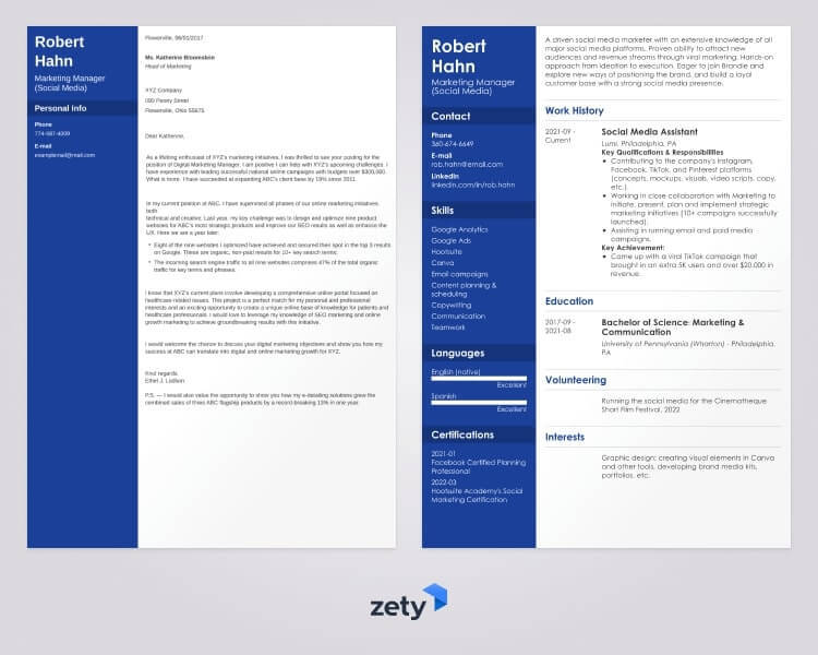
Plus, a great cover letter that matches your resume will give you an advantage over other candidates. You can write it in our cover letter builder here. Here's what it may look like:
See more cover letter templates and start writing.
Key Takeaway
So, what do you think? Not so hard, after all, was it?
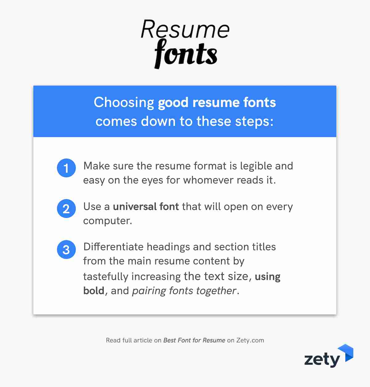
Choosing good resume fonts comes down to this:
- Make sure the resume format is legible and easy on the eyes of whoever reads it.
- Use a universal resume font that will open on every device; you don’t want tofu!
- Differentiate headings and section titles from the main resume content by tastefully increasing the text size, using bold, and pairing fonts together.
Have any questions on how to choose the best resume font? Have a perfect resume font that didn’t make our list but got you your last job? Share it with us or just give us a shout in the comments below and we’ll answer your question. Thanks for reading!
About Zety’s Editorial Process
This article has been reviewed by our editorial team to make sure it follows Zety's editorial guidelines. We’re committed to sharing our expertise and giving you trustworthy career advice tailored to your needs. High-quality content is what brings over 40 million readers to our site every year. But we don't stop there. Our team conducts original research to understand the job market better, and we pride ourselves on being quoted by top universities and prime media outlets from around the world.
Sources
- Mareike Bayer, Werner Sommer, Annekathrin Schacht, “Font Size Matters—Emotion and Attention in Cortical Responses to Written Words”
- Microsoft.com, "Cambria font family - Typography"
- Alice Rawsthorn, "Quirky serifs aside, Georgia fonts win on Web - Style - International Herald Tribune"
- Mareike Bayer, Werner Sommer, Annekathrin Schacht, "Font Size Matters—Emotion and Attention in Cortical Responses to Written Words"
- John T. E. Richardson, "The Legibility of Serif and Sans Serif Typefaces: Reading from Paper and Reading from Screens"

